1989: Robert Mapplethorpe

This slideshow requires JavaScript.


Robert Mapplethorpe was the subject of two retrospectives in the last year of his life, Robert Mapplethorpe, at the Whitney Museum of American Art (26 July – 23 October 1988) and Robert Mapplethorpe: The Perfect Moment, organized by the Institute of Contemporary Art in Philadelphia, which traveled to five other museums in 1989-90.

The religious right successfully pressured the Corcoran Gallery of Art in Washington to cancel the The Perfect Moment before it opened in 1989 and caused the Cincinnati district attorney to bring criminal obscenity charges against curators of the Cincinnati Contemporary Arts Center in 1990. Right wing politicians made Mapplethorpe and the exhibition the centerpiece of their campaign to discredit and do away with the National Endowment for the Arts, which ultimately failed.

I want everything to be perfect, and of course it isn’t. And that’s a tough place to be because you’re never satisfied.
–Robert Mapplethorpe, 1987

In the starkly-lit, static, black and white photos he produced in the last years of his life, which were heavily featured in the 1988-89 exhibitions, Mapplethorpe certainly aimed at perfection. The still-life arrangements, portraits and heroic nudes are virtually Neo-classical in their purity, restraint, and severity. Every object his camera focuses on turns to stone. In his late portraits in particular, faces are slightly over-lit, like old Hollywood publicity shots, to create a soft focus, luminous effect very close to the lustre of polished marble; applying this technique to actual statuary allows hard surfaces to appear soft and mutable.

I really believe that Robert sought not to destroy order, but to re-order, to re-invent, and to create a new order.
—Patti Smith, 2010

Deeply influenced by Edward Weston and Minor White, Mapplethorpe used the camera to abstract from objects and bodies an inner or underlying essential form. The effect of timelessness—a moment captured and preserved—is, to some extent, unavoidable in photography. When a photographer takes as his or her subject nothing less than beauty itself and purity of form, time ceases to be a referent at all.

In the 1980s, critics praised Mapplethorpe either for his transgressive depiction of graphic and hitherto unrepresentable content or his formalism, which gave the impression of a seemingly split artistic personality (the essays in the Whitney catalogue read as if they were about completely different artists). The problematics of foregrounding the formalist over the hardcore Mapplethorpe became very evident in the expert testimony in the Cincinnati trial, which attempted to explain one version of Mapplethorpe in terms of the other.

Because his Black Book photos are now widely-known, and due to changing perceptions of gay sexuality, Mapplethorpe’s work is less shocking than he was in 1989 (which is what it sought to achieve, on some level). This makes the consistency of his visual interests clearer. The perfect moment turns out to be the perfect form, which is visible in all subjects once the filters of the dominant paradigm are removed.

This concludes The Art of the 1980s series.

1983: Barbara Kruger

This slideshow requires JavaScript.

The Institute of Contemporary Art in London mounted the exhibition We Won’t Play Nature to Your Culture: Works by Barbara Kruger in 1983. The show featured Kruger’s first works executed in what would become her signature style— large-scale, black-and-white images appropriated from popular culture, overlaid with red or black bands, bearing cryptic texts rendered in Futura drop out-letters. Several of the works were also included in the 1983 Whitney Biennial.

When Mary Boone stated that her gallery’s roster of artists was all male because women artists didn’t sell, she was spoke a little too candidly about an ugly reality of the art market. Barbara Kruger had made it clear that not only could work by women artists sell, but that work by polemical, uncompromising, feminist artists could, and did, sell. Boone responded by signing Kruger, her first woman artist, in 1987, and giving her carte blanche to transform the West Broadway space for her first show in the same year.

Feminist art of the 1970s was largely concerned with the recuperation of craft traditions, which resulted in earnest, handmade objects. Kruger, who had learned the arts of visual persuasion while working as a commercial layout designer (specializing in text) at Condé Nast, took a different approach. Like the Russian Constructivist graphic artists, who used avant-garde means to accomplished radical political ends, believing that a revolution required revolutionary art, Kruger presented feminist political thought in a clean, modern, professional style on an assertive billboard scale.

The combination of meticulous graphic design, concise, yet eliptical, slogans and ironically-recontextualized, popular imagery made feminist agit-prop seem hip, confident and current. Like Keith Haring, another commercially-trained artist, Kruger knew how to use images to get the public’s attention and her visual style, like Haring’s, caught on immediately. Just as Haring’s art did much to incite action to fight AIDS, Barbara Kruger’s art played a significant part in the re-energizing, expansion and changing of the public’s perception of the feminist movement that took place in the 1980s, role for which she has yet to be fully acknowledged.

By the end of the 1980s Kruger, now an established art star, stepped up from the insular art world to the national stage, where she exerted a clear influence on the shaping of public affairs through the creation and deployment of stark images like with memorable rallying cries like Your Body is a Battleground. Designed for the Women’s March for Reproductive Rights on on Washington DC in 1989, the poster went on to become the standard of an entire movement. In a decade of political art, Kruger’s set a benchmark that has yet to be surpassed in terms of its political prestige, influence and widespread instant recognition.

1980: Cindy Sherman

Cindy Sherman composed and mostly shot the 69 photographs of the Untitled Film Stills series between the years 1977 and 1980. They were first exhibited in early 1980 at The Kitchen; later in the same year, the series was chosen to be the inaugural show at Metro Pictures.

Basing her cinematic clichés on the lurid, high-cholesterol psychodramas of Sirk, Hitchcock and Fellini, Sherman qua actress, lays it on thick, pushing makeup, wardrobe, wigs and facial expressions to the edges of camp. Shernan qua director, however, is a model of restraint and understatement, allowing the work’s central irony to come into view only at its conclusion, when we realize that the identity of the artist is not occluded or negated by the compulsive adoption and abandonment of identities, it is the sum of them. The more she proliferates roles, personae, and disguises, the more Sherman reveals of herself; she is everywhere and nowhere in the series. Personal identity, for the Pictures generation, is constructed from an ever-changing array of images of attitudes, incidents, and outfits, the only constant being the act of perceiving them. This proposition could have beem cast as an existential paradox (i.e., Bergman’s Personae), but Sherman sees it as an irony inherent in all acts of representation.

In 1995, The Museum of Modern Art bought the Untitled Film Stills series from Sherman for $1 million (they would fetch far more today). In a perfect moment of 1980s synchronicity, the ensuing MoMA exhibition, Cindy Sherman: The Complete Untitled Film Stills (1997), was sponsored by Madonna.

EILEEN QUINLAN

This slideshow requires JavaScript.


EILEEN QUINLAN (American, b. 1972)

Read this introduction to the work and person of Eileen Quinlan by Steel Stillman (Art in America, 8 March 2011)

– and –

this review by Maika Pollack of the New Photography 2013 show at the Museum of Modrern Art, in which Quinlan’s work is discussed (Gallerist NY, September 24, 2013).

GOD SAVE THE QUEEN: Recent Portraits of Elizabeth II


GOD SAVE THE QUEEN: Recent Portraits of Elizabeth II

Elizabeth II, the queen regnant, is the most-portrayed individual in history, with some 819 official portraits logged since her birth in 1926. Some have been spectacular successes, like Pietro Annigoni’s portrait of the young queen, wearing the robes of the Order of the Garter, painted for the Worshipful Fishmonger’s Company in 1955 and Cecil Beaton’s glamorous photographs of the 1960s; others have not. The failed images go wrong by employing the conventions of aristocratic portraiture of the 18th and 19th centuries for the representation of 20th- and 21st-century subjects. The old formula, which dates back to Van Dyck and Rigaud, calls for military bearing, an idealized yet expressionless face, an impersonal gaze fixed just above the viewer, and places the subject at a distance, both figuratively and literally, from the viewer. When used to portray modern monarchs, those conventions, along with the academic finish and oil paint medium, which are meant to lend dignity to the image, contribute to the pervasive sense of out-datedness, from which flows irrelevance.

In the past 15 years, the Queen has made a conscious effort to keep her public image current by sitting for portraits by critically-admired contemporary artists who work in the visual idiom of her own era, and not that of Queen Anne. This means more photographic portraits and fewer paintings, and the paintings that are commissioned are mainly executed in acrylics. The tone or overall valence of these portraits is different, because the artist, self-effacing in the old formula, is now as much of a presence as the subject. And she is amenable to the process: Elizabeth II is a skilled photographer herself and has hundreds of hours of modeling experience from sitting for her portraits so she is perhaps the portraitist’s ideal subject.

The license to do as they saw fit resulted in the artists thinking about the monarchy and developing highly individual approaches to recording the image of a ruler for posterity. She allowed Lucian Freud to bring us right up to her face and to frankly portray the signs of old age in a non-sentimental manner and which does not suggest a meretricious sense of familiarity. She has also allowed a note of ironic self-awareness to be registered, as seen in the Queen of Scots portrait by Julian Calder (for which she had to stand in a gnat-ridden bog in full regalia for hours) and she gave a cinematic performance of her various official selves and their wardrobes for Annie Liebovitz.

For Chris Levine’s holographic portrait, Lightness of Being, which doesn’t even refer to the Queen in its title, the artist–who is known for his highly-artificial, stylized photographs of Kate Moss and Barbie–has created a superb, completely up-to-date look for the modern monarch, by styling her with makeup and wardrobe that is coolly chic, but appropriate to her royal dignity. In many portraits from the 1960s through the 1980s, the Queen makes eye-contact with the viewer. This was meant to bridge the distance between monarch and subject, but in the end it creates an annoying sense of fake intimacy neither side believes (remember, in the 18th century it was considered a grave offense to look the Sovereign in the eye). Levine drops that convention, and the distant gaze that preceded it, and instead daringly portrays the queen with closed eyes (during sittings for a holographic image made for a bank note, Levine snapped the source still photo while the Queen closed her eyes to rest them in between takes). This conceit forecloses the fatuous illusion of familiarity proposed by the look-you-in-the-eye genre, bluntly informing us that she is distant, that she is not your familiar, but she also not going to lie to you and pretend otherwise. This is not atavistic; it shows clear thinking about about the nature of the monarch, which makes for memorable images.

We recognize the faces of Henry VIII, Charles V, Phillip IV, Louis XIV, and Napoleon because they have been captured by Holbein, Titian, Vélazquez, Rigaud and David; and we do not not remember what Charles II, Leopold I, Charles X, Franz-Josef I or Edward VII because they were painted by less inventive artists. The Queen, too, clearly knows that in the future, her features and her reign will be remembered insofar as the artworks that represent her are remembered and given her recent choices, it seems likely hers will remain a familiar face in the centuries to come.


CPU DIE SHOTS

This slideshow requires JavaScript.


The Aesthetic of the Chip

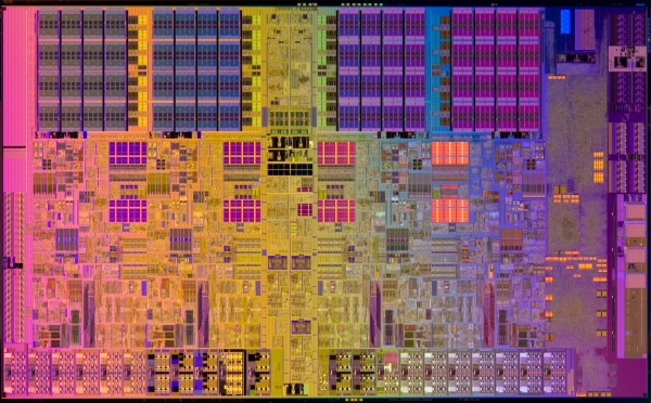
THE DIE SHOT is the computer industry’s version of the money shot. These gorgeous photographs of a chip’s die, a block of the semi-conducting material of which integrated circuits are composed, are shot under intense light with a high-resolution digital camera using a macro lens or with a combination of microscope and camera. With their geometrical abstract forms and iridescent, jewel-like colors, the die shots look like a psychedelic form of modern art—think Paul Klee on blotter acid. These ravishing images were taken from, several sources, including IC Die Photography and CPU World

FASTER THAN PAINTING: Thomas Struth

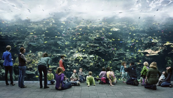
Thomas Struth (German, b. 1955) studied painting at the Düsseldorf Kunstakademie 1973-77, where he was a student of Gerhard Richter and Hilla and Bernd Becher. His is the highest profile member of a group of German photographers, including Andreas Gursky, Candida Höfer, Jeff Wall, and Thomas Ruff—who work in the medium of monumental color photography using large format cameras and emulsion film. He is currently based in Berlin and New York.

The following quotations were culled from a profile written by Janet Malcomb for The New Yorker in 2011:

On his experience as an entering student at the Düsseldorf Kunstakademie in 1973:

When I came there, it was a shock to realize that I had to regard art as a serious activity and develop a serious artistic practice. Painting and drawing was no longer my hobby, a private activity that I enjoyed. It was something that had categories. Artists were people who took positions and represented certain social and political attitudes. It was an intense experience to realize this. There was very intense judgment by the students—who is doing something interesting and who is an idiot painting lemons as if he were living in the time of Manet and Cézanne.

On painting versus photography:

After I started taking photographs from which I would make my paintings, I realized that the photograph already does it. The photograph already shows what I want to show. So why make a painting that takes me five months to finish and then it looks like a photograph?

On the limitations of the photographic image:

Some of the pictures don’t show what I was thinking. For instance, when I went to Cape Canaveral as a tourist I was struck with the sense of the space program as an instrument of power. When, as a state, you demonstrate that you are able to do that, it contributes to cultural dominance. I hadn’t realized this before. But when I went there to photograph I saw that it is something you cannot put into a photograph.

A note on the source article:

Early on in her profile of Thomas Struth, Janet Malcomb seems to say that because critical response to Struth has been uniformly positive, she will respond negatively on principle. Throughout her article, Malcomb exhibits a very palpable, and inappropriate hostility to Struth, insulting, criticizing and correcting him at every turn. She deplores castigates critics who admire his work; she misinterprets his photographs; makes middle-brow jokes about his work, and ends the article on a note of particular malice by belittling his recent portrait of Queen Elizabeth II and Prince Phillip and then raving about a casual snapshot of Struth, the Queen and the Duke taken by Struth’s assistant after the shoot. She ends by reminding Struth that the Queen had not made her opinion of his portrait known, and then implies he is shallow for caring her opinion, when she was the one who brought it up.

The New Yorker profile is not the right venue for mounting revisionist interpretations of an artist’s work, and, based on her comments on artists, photography and critics, Malcomb would not be the best person to mount that revision.

POST/PRE-PHOTOGRAPHY: Marco Breuer

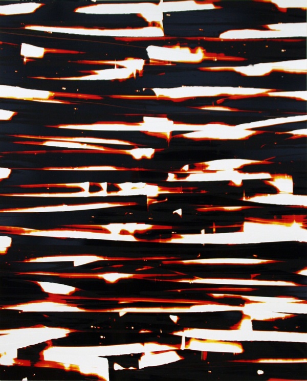
As completely as No Wave destroyed rock music, in or around January 2006, Marco Breuer ended photography as we know it. He did so by reviving various technologies present at its inception, such as cyanotype and gum bichromate, and he did so, fittingly, without benefit of a camera, lenses, film, or negatives. By subjecting photographic paper to processes that ranged from invasive to destructive (The New Yorker referred to his work as “creative violence”), he produced a scarred and damaged contrapositive of the negative that recorded nothing other than the ordeal of its making.

Breuer himself described his project in milder terms, telling an interviewer that he

was attempt[ing] to strip down the photographic process, to remove the distractions of equipment, and to force imagery out of photographic paper itself. I am interested in the intersection of photography and drawing: the negotiation of the illusionistic space of photography versus the concrete space of the physical mark.

The distractions of the photographic apparatus having been eliminated, do the resulting objects constitute photography or the appropriation of the wreckage of one medium by a newly-minted one? Can the process of deconstructing photography produce photography? If it is photography that remains, at what register of cognition or in which conceptual framework does it intersect with drawing?

Blog at WordPress.com.

Up ↑